Energy Company
Chaos to Order
Overview
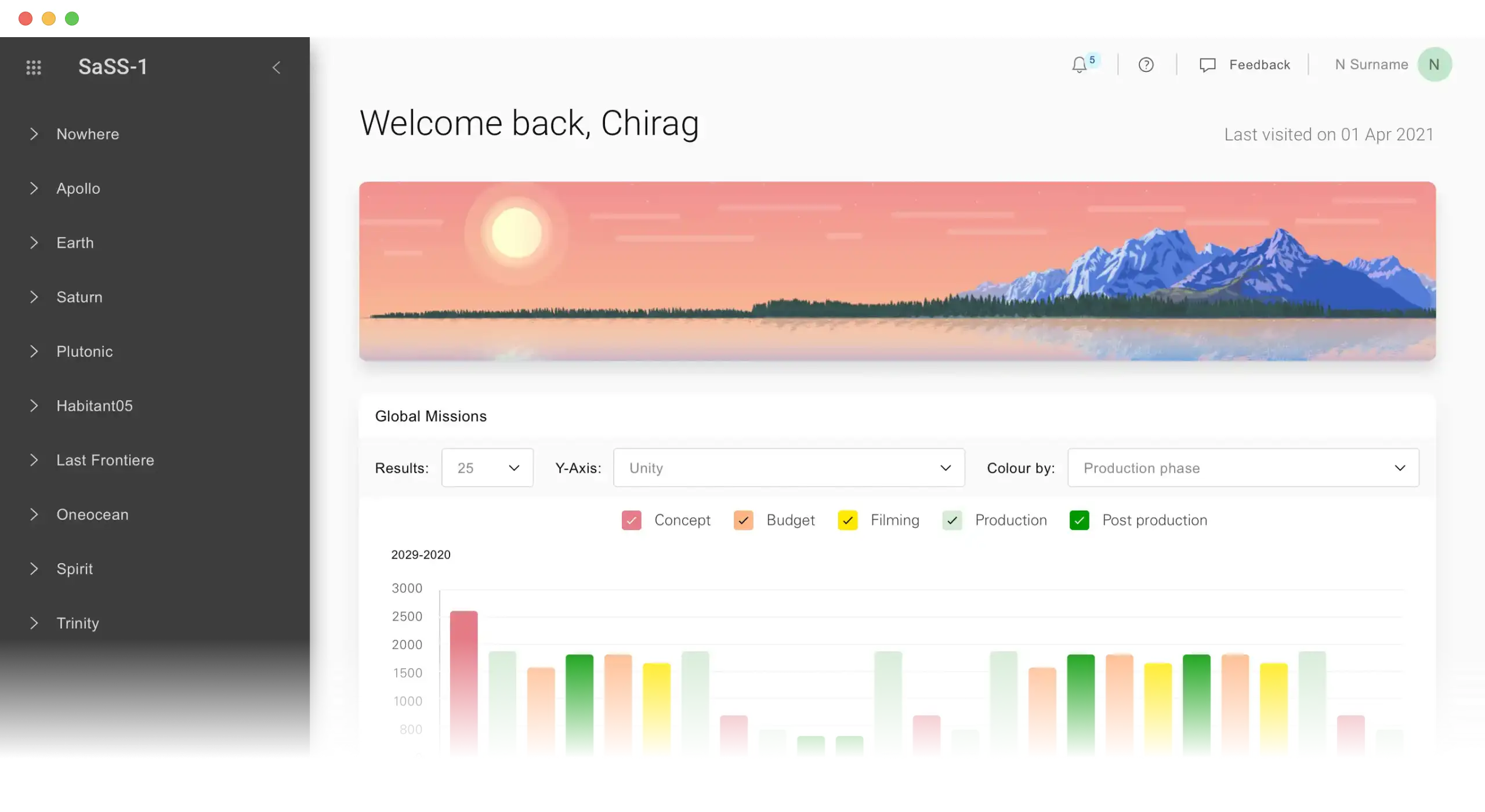
I joined this internal SaaS platform after it had already been built and released. The product was difficult to use, visually inconsistent, and frequently broke on the laptops most geologists used. I led the redesign of the interface, navigation, and a UI Kit, transforming it into a more accessible, responsive, and scalable experience.
Tech Stack
Sketch
Frontend
VSCode
Azure Dev Ops
Facing
The Challenge
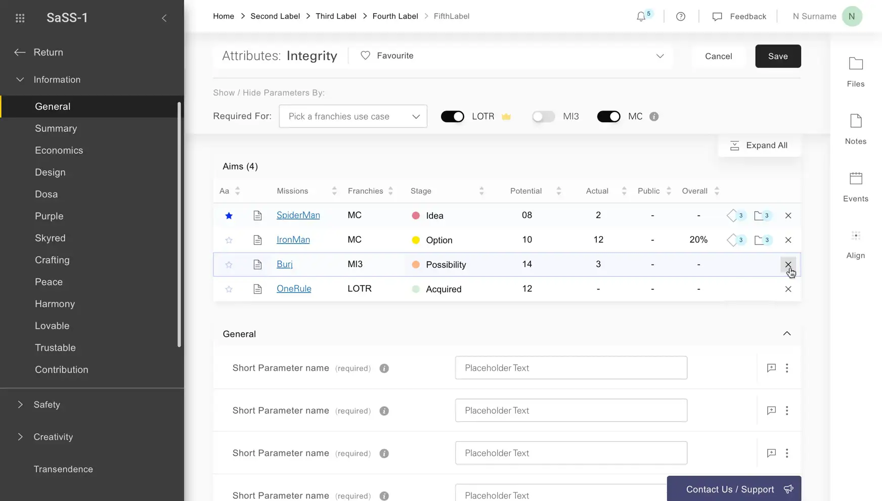
The existing interface lacked a clear structure. Layouts and critical tasks were hidden behind secondary content, contributing to user experience issues and slowing down the most important workflows.
User testing revealed that important data fields were ranked near the bottom of complex form pages, while secondary elements drew attention first and made the flow feel heavier than it needed to be.
Foundational
Outcome & Reflection

I led the app redesign, focusing on accessibility, navigation, and UI Kit. The feedback from users was that it reduced the visual noise and helped make them feel calmer.


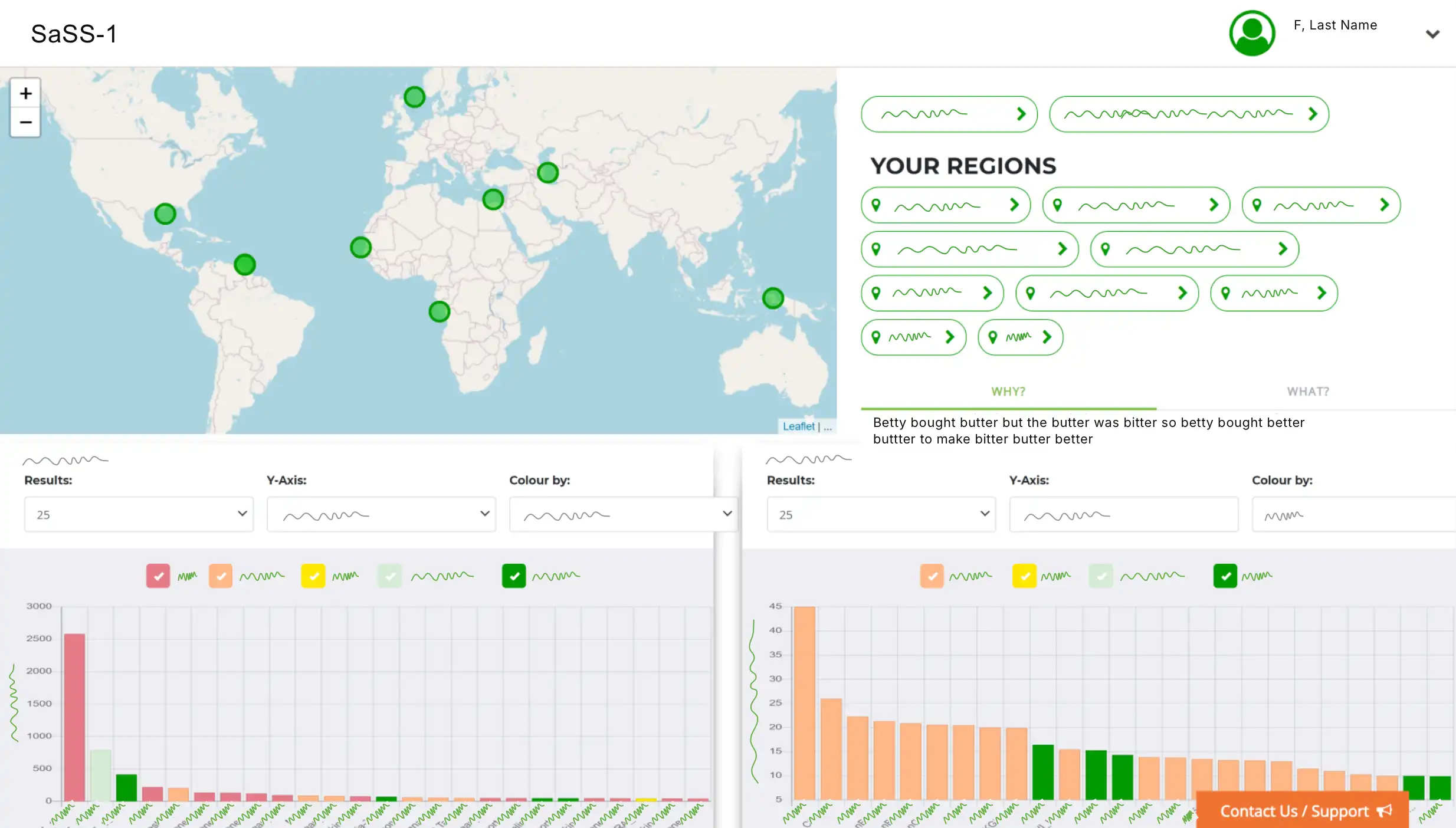
Custom illustrations inspired by each region were designed, making the interface feel more human and grounded in its world. At the same time, the company was building a wider design system, so I used this opportunity to create a dedicated component library for the application that aligned with the new ecosystem and set a stronger foundation for future growth.